DISCOVER - FEATURE RELEASED
Providing Progress Visibility in Loan Assistance Programs
Output
iOS + Android feature within Discover's existing design system
Role & Client
Role: UX Designer
Company: Kin and Carta
Client: Discover Banking
Team
10 stakeholders, 1 Scrum Master, 1 Sr. UX Designer (me), 1 UX Researcher, iOS + Android engineering
AT A GLANCE
What if the most stressful moment in a customer's loan journey was the one where the app finally saw them?
Most people enroll in a loan assistance program once in their life. That makes the experience unfamiliar, confusing, and often quietly embarrassing. Discover's mobile app didn't acknowledge this moment at all: customers couldn't see their progress, didn't understand the rules of the program they were in, and had no encouragement to keep going.
As Senior UX Designer on a Kin and Carta team, I led the design that brought visibility and a measured sense of care to this part of the app.
3
Different loan programs handled by one consistent design system
5
Moderated user interviews informing the design
Shipped
Implemented across iOS and Android
Solution
A loan assistance experience that gives customers a clear answer to two questions: "where am I?" and "am I going to be okay?"
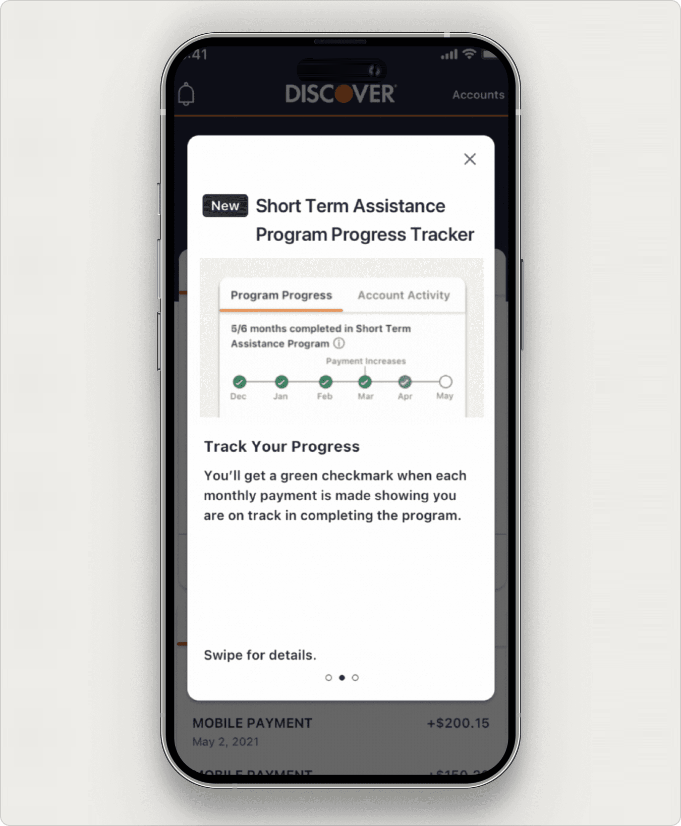
Onboarding screens with GIFs that explain what's new and how the program works.
Onboarding screen 2 of 3.
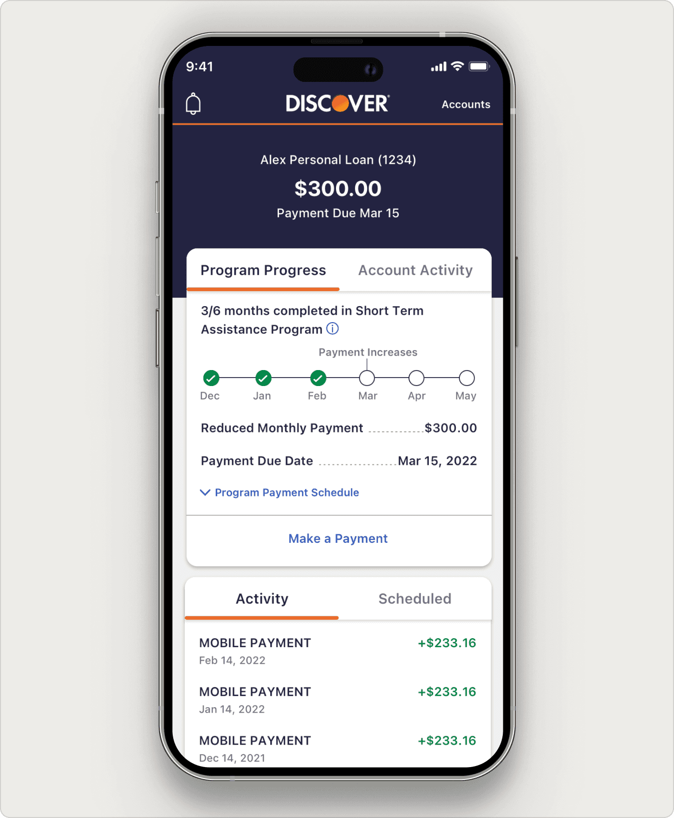
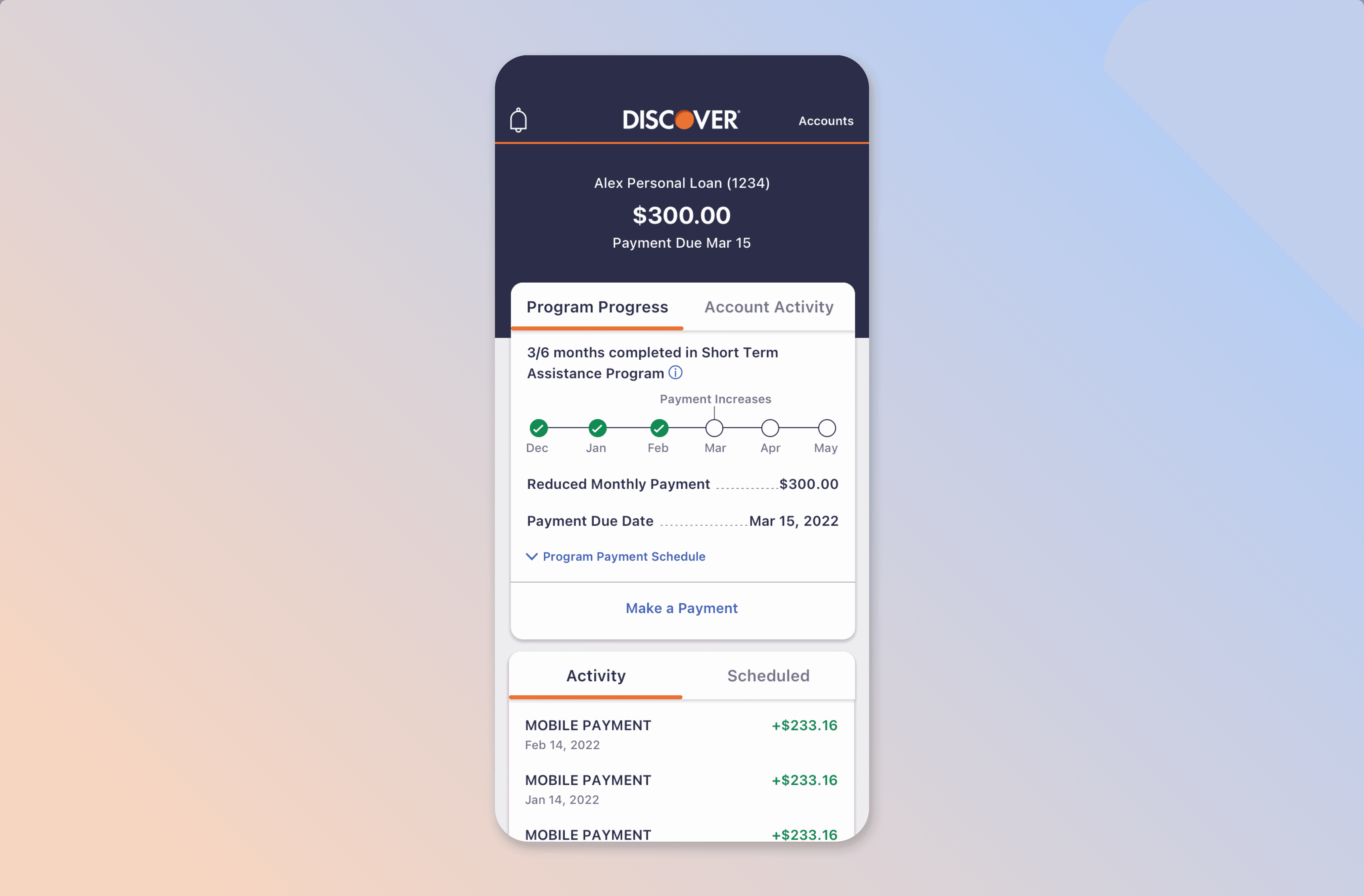
A progress tracker that shows months, on-time payments, and missed payments at a glance.
The progress tracker in the final design.
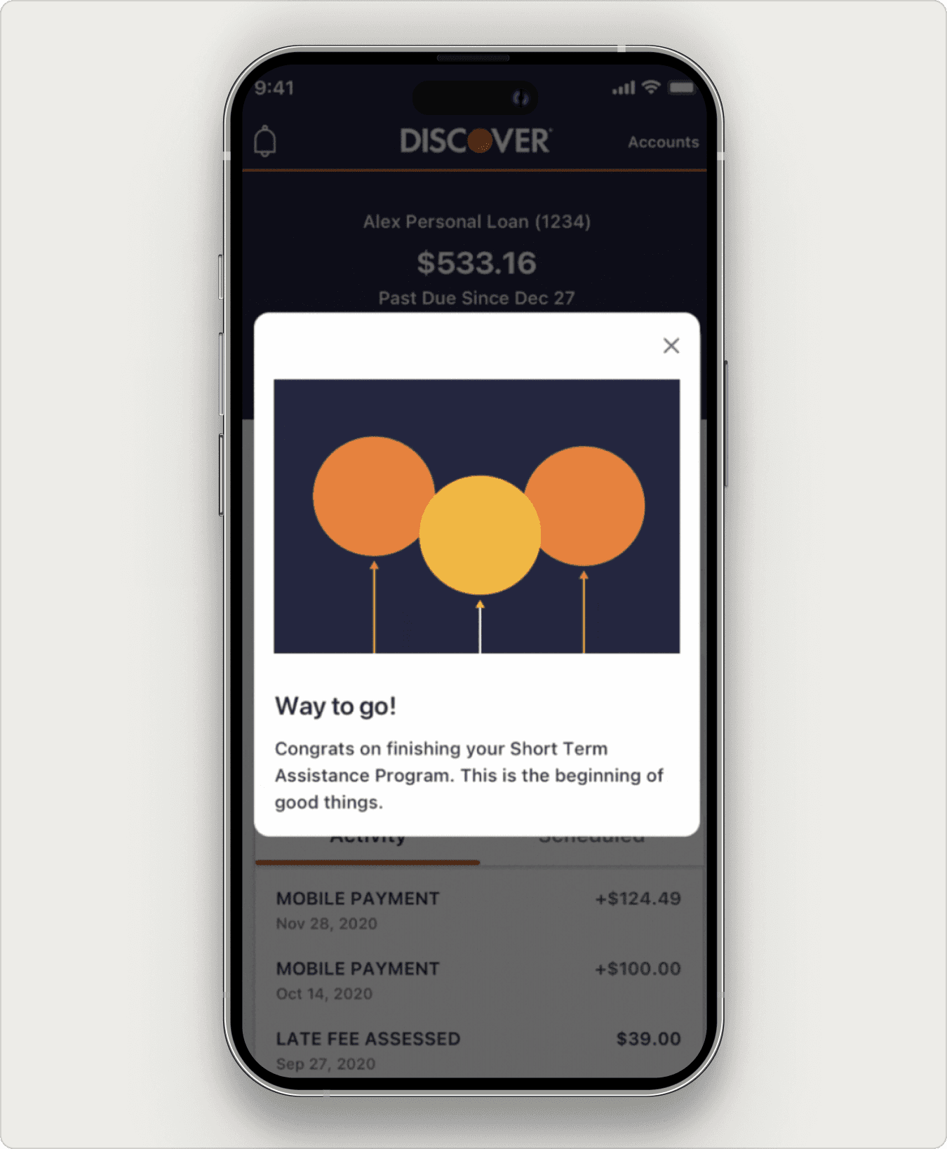
Quiet encouragement moments at the halfway point and on successful completion.
The completion modal
THE STAKES
Designing for a moment customers don't want to be in.
Loan assistance programs exist because someone is struggling. Discover offers three of them: Short Term Assistance, Long Term Assistance, and Payment Deferral. Each has its own quirks: tiered payments, payment deferrals, term extensions, and last-three-months payment changes. Customers who hadn't seen this part of the app before were navigating it during the most financially anxious moment of their year.
For Discover, the stakes were equally clear. Customers who can see and understand their program are more likely to complete it. Visibility is care, but it's also a business outcome.
HMW
How might we make this feature feel like a steady hand, not a spotlight, while keeping it precise enough for three very different programs?
WHAT WE HEARD
Five interviews. Three findings.
I worked with our UX Researcher on five moderated interviews with current Discover customers enrolled in loan assistance programs. The goal was to understand both the practical confusion and the emotional weight of the experience.
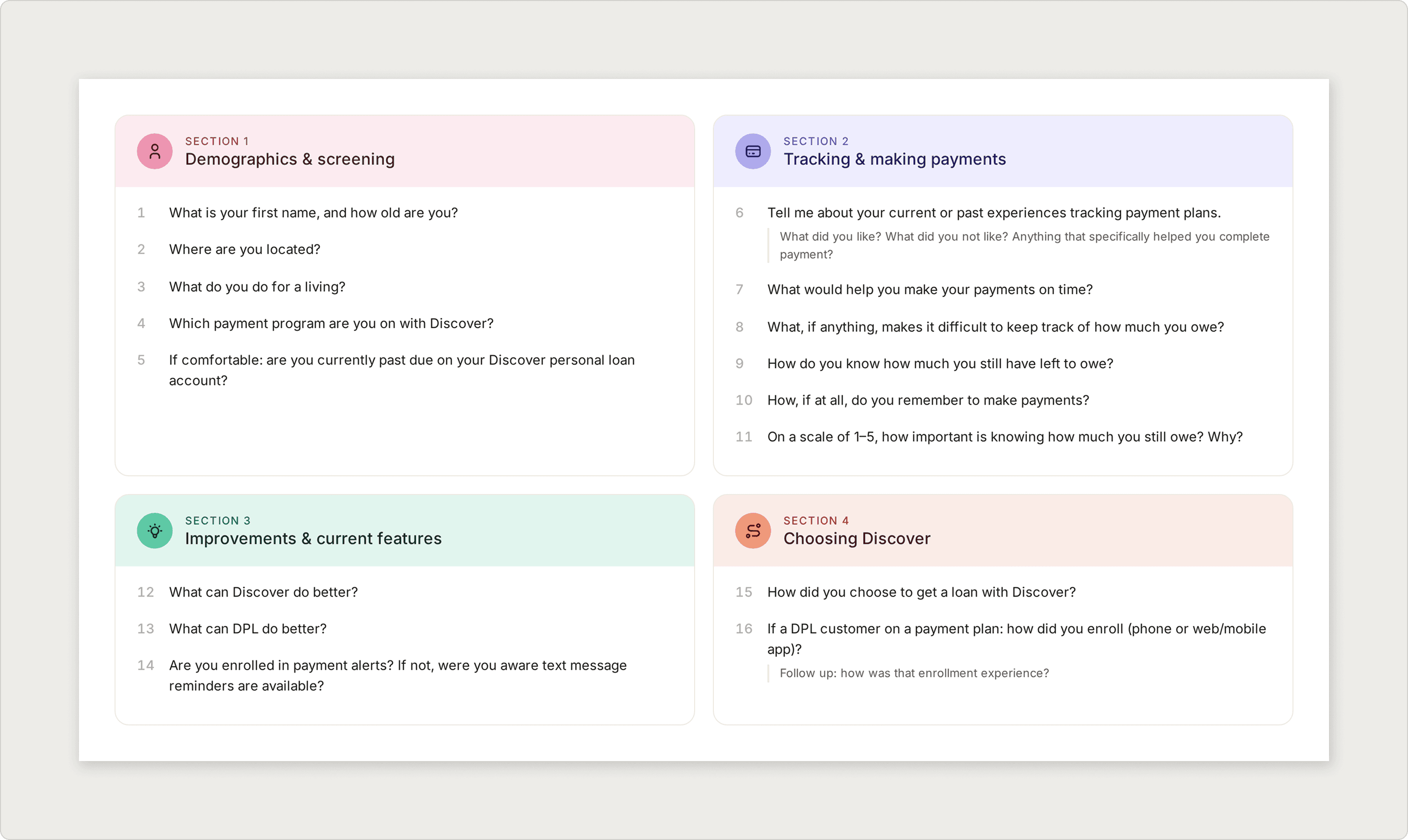
Discovery question set used in interviews.
Three Findings
01
Customers feel embarrassed about being on the program
The dominant emotion in research wasn't confusion. It was self-judgment. Customers described feeling like they had failed, even though enrolling in the program was the responsible thing to do.
02
Customers don't know which program they're on or where they stand
Most customers couldn't accurately describe the program they had enrolled in. Tiered payments, payment deferrals, and last-quarter changes were a black box.
03
Customers check Discover on their phone, not their desktop
Loan assistance information needed to live where customers actually look for it.
KEY INSIGHT
The information gap and the emotional gap are the same design problem. Customers needed to know where they stood and feel that someone, somewhere, was rooting for them. Solving for one without the other would have missed the brief.
DESIGNING WITH CARE
How might we explain a complicated program, track progress against it, and encourage the customer, all inside an existing design system?
Three Customer States, Three Content Paths
Loan assistance customers don't all behave the same way. We defined three content states that the feature had to handle: customers on track, customers who had missed a payment, and customers who unenrolled before completion. Each one needed different copy, different alert behavior, and different progress tracker logic. We mapped a user flow per state so engineering could see all the paths up front.
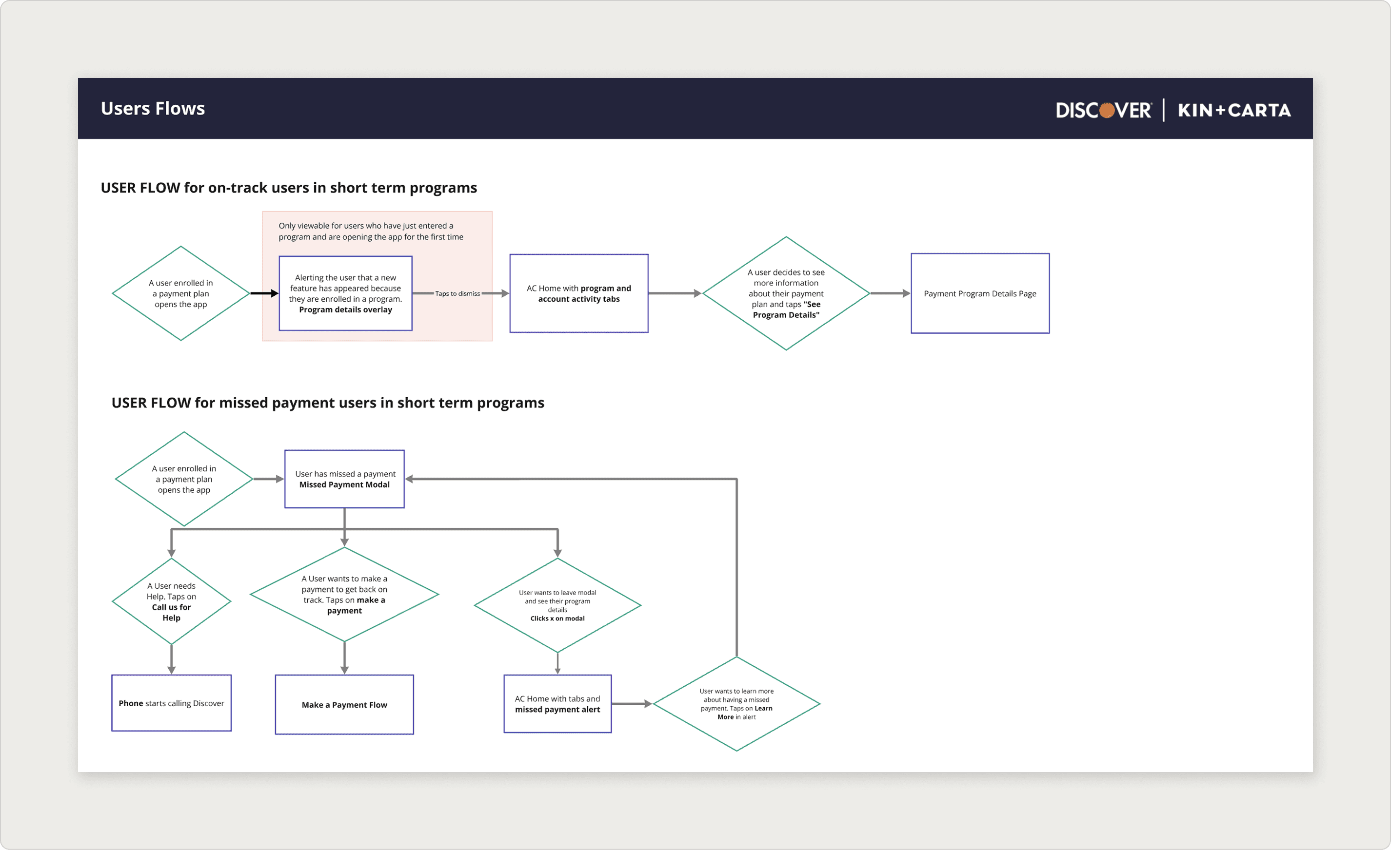

User needs and flows broken out by customer state.
Lo-fi First, Because of Stakeholders
Ten stakeholders is a lot of voices. I started the project in low fidelity on purpose, knowing weekly reviews would dominate the schedule. Lo-fi let us focus the conversation on flow, content, and tone, not on color and type, until we had alignment on the structure underneath.
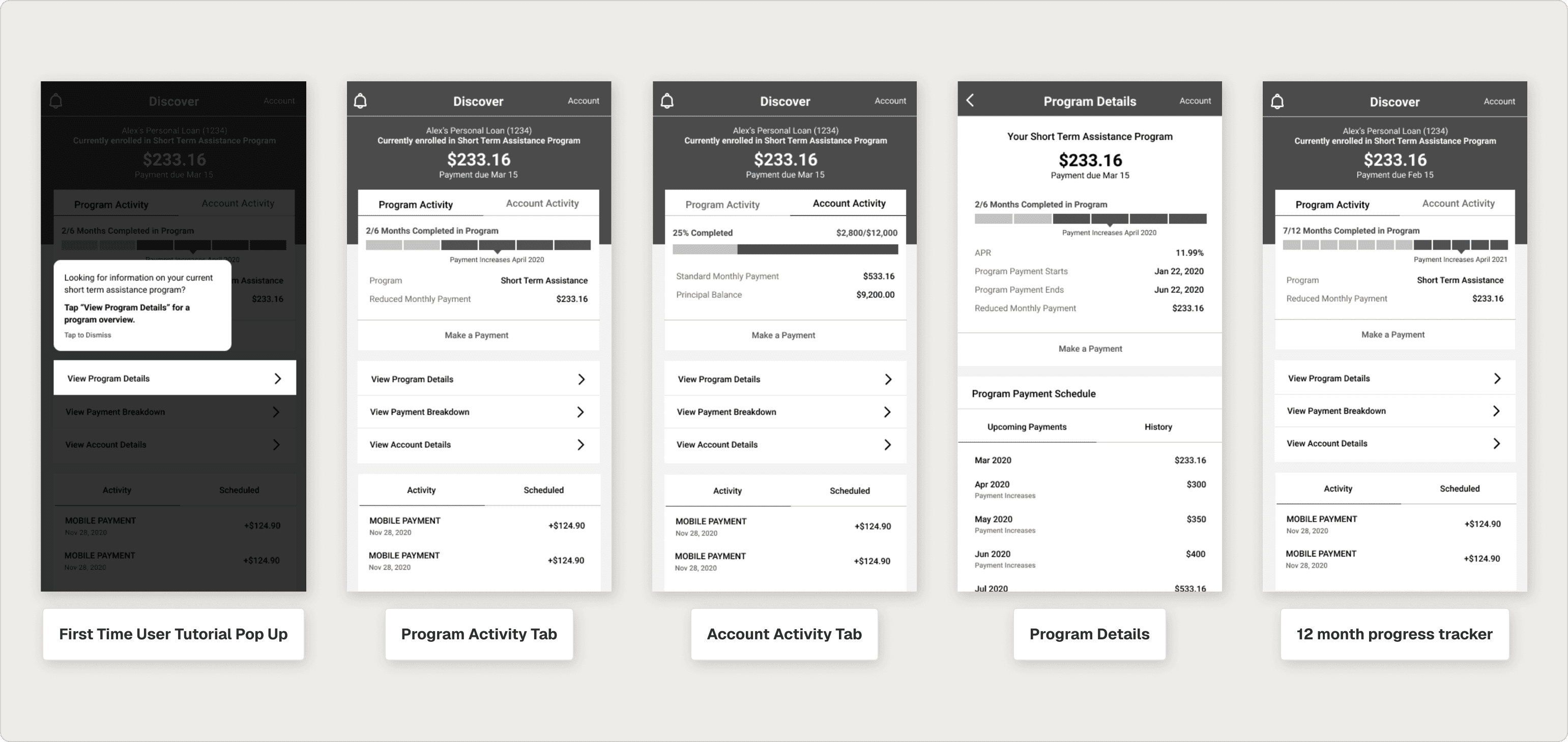
Early low-fidelity exploration.
User Feedback Heard and Incorporated
Our initial progress bar didn’t effectively motivate users throughout their loan repayment journey. It was confusing for users to track their progress and connect the colors to successful or missed payments
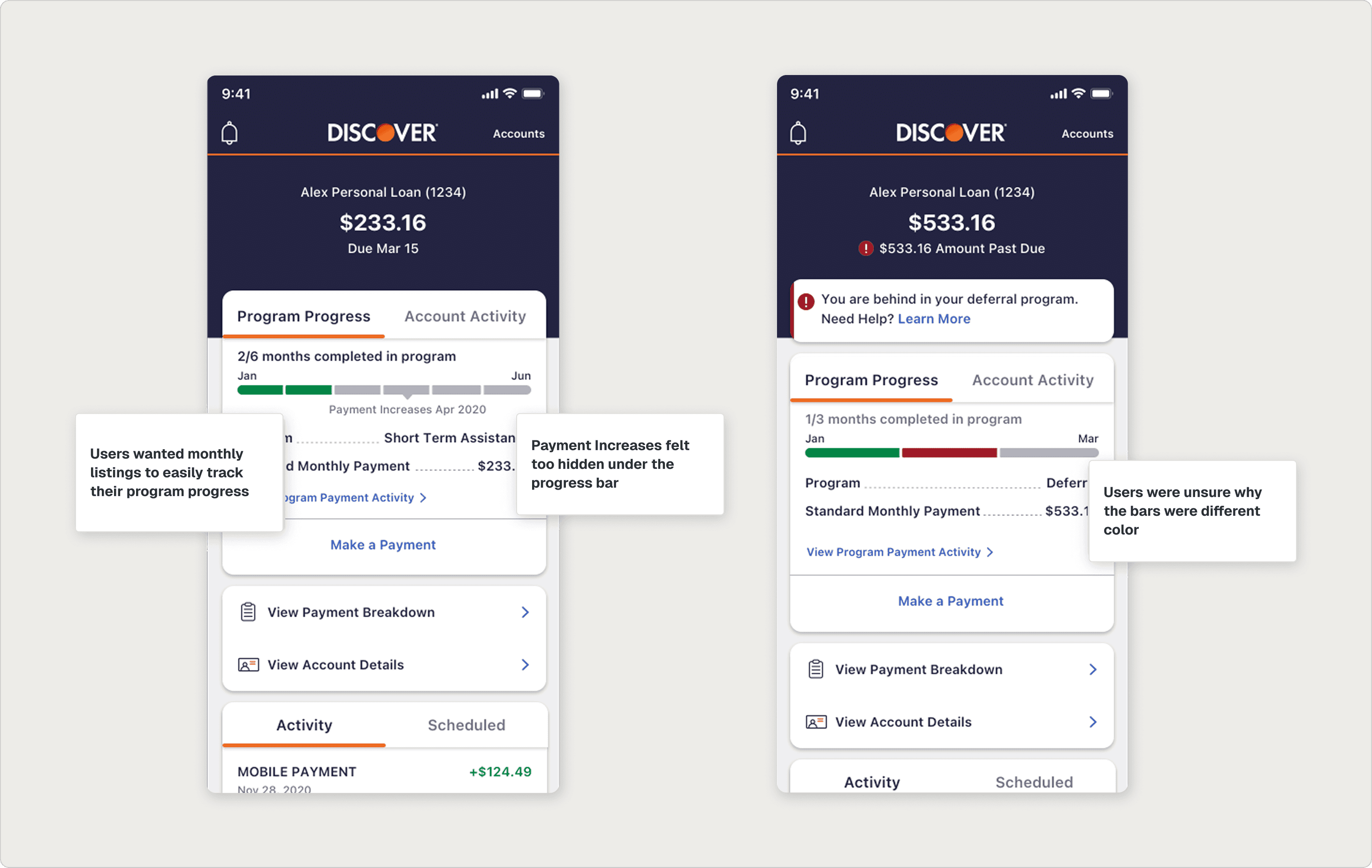
User feedback that we heard around viewing progress and potential confusion around it.
THE FEATURE
What shipped to ios and android.
Onboarding
A three-screen onboarding flow with subtle GIFs introduces the new feature, explains the on-time payment checkmark, and shows customers how to expand the accordion to view their payment schedule. Each screen does one job and then gets out of the way.


Onboarding modals involved GIFs to effectively show where users can see critical information.
The Progress Tracker
The first iteration of the progress bar didn't help customers locate themselves in the program. After multiple rounds of testing, the final tracker uses months across the top, on-time check icons for successful payments, and a distinct missed-payment icon that matches the alert banner above it. The icon match is small but meaningful: it ties the alert to the tracker, so a customer instantly knows what went wrong and where.
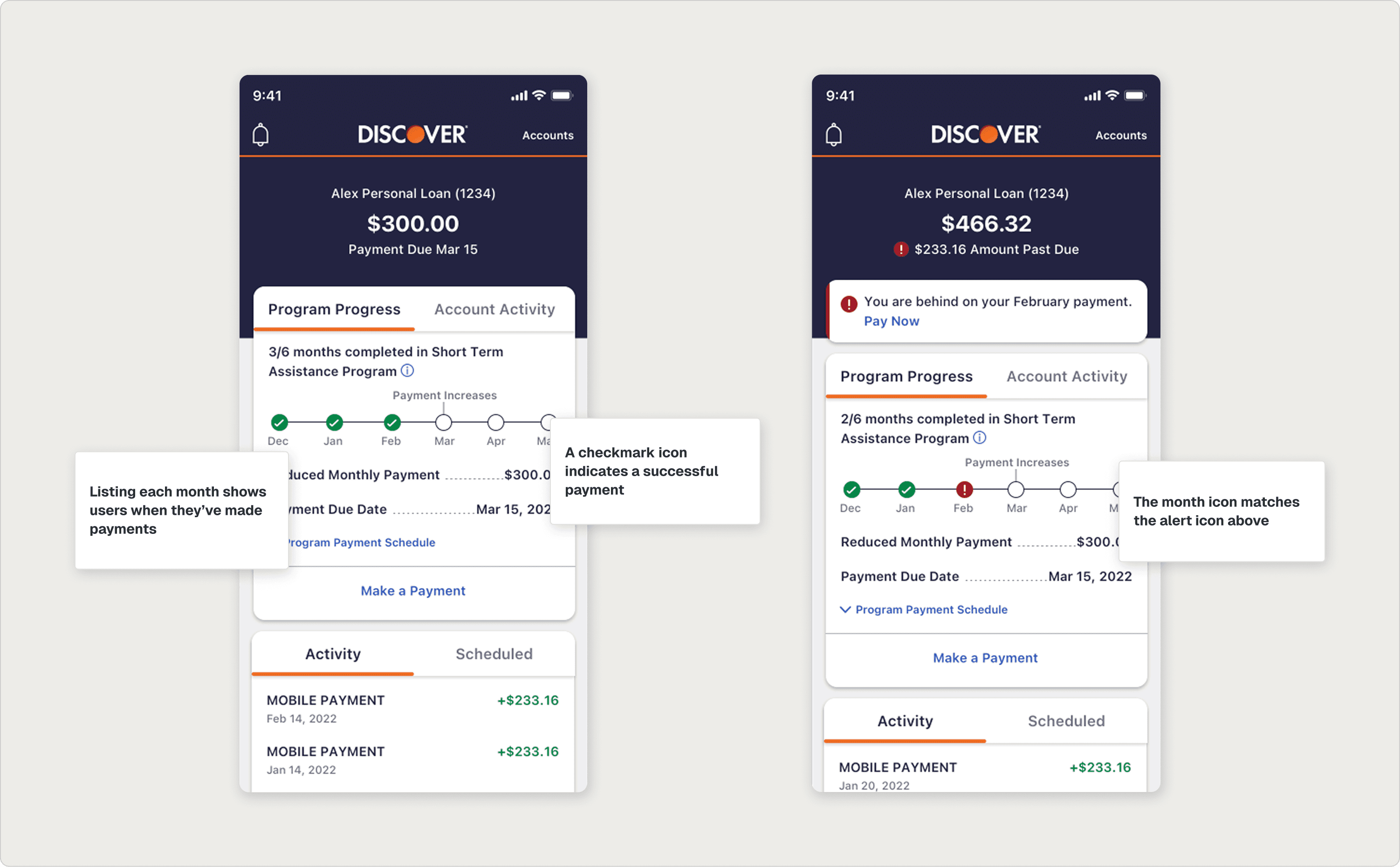
Updated progress bar designs to show exactly where a user is in their payment flow.
Encouragement Moments
Two motion moments mark the customer's journey: a halfway-point GIF that recognizes the milestone without overdoing it, and a completion modal that genuinely celebrates the end of the program. Both fit inside Discover's design system and stay on the right side of dignified.


Halfway-through and completion moments.
A Full Feature Shipped
The feature passed final design review and was handed off cleanly to iOS and Android engineering, where it was implemented inside Discover's mobile app.

REFLECTION
What I learned.
01
When customers are at a low moment, design has to acknowledge it.
The most important design decision on this project wasn't a screen. It was the team's agreement that embarrassment was the emotion we were designing around. Once we named it, every other decision (motion, tone, copy length, modal frequency) had a clear test to pass.
02
Lo-fi is a stakeholder management tool.
Ten stakeholders reviewing weekly could have killed the project's momentum at high fidelity. Staying lo-fi early let stakeholders weigh in on the things they actually had opinions about (flow, content order, scope) without the conversation drifting to color or type. By the time we moved to hi-fi, the structural arguments were already over.
03
Existing design systems can hold new emotion. You just have to choose the smallest element.
I didn't ask Discover's design system to do anything radical. I asked it to support a few new GIFs, one new icon, and a handful of motion moments. The system held. The emotional shift was real. Sometimes the right intervention is the most modest one.