TABLET APP · RAVEN HEALTH · Shipped 2021
Modernizing ABA Therapy Data Collection With One Intuitive Tablet App
Team
1 PM, 1 Design Lead, 1 UX Designer (me), 4 Developers
Role & Client
Role: UX Designer
Company: Kin and Carta
Client: Raven Health
ravenhealth.com
Skills
User Research, Personas, Journey Mapping, Feature Prioritization, Lo-fi Sketching, Usability Testing, Design System
OVERVIEW
What if therapists could collect session data as fast as they could think it?
The ABA (Applied Behavior Analysis) therapy industry runs on data, but data collection itself is stuck in the past: some clinics still use paper, others use clunky desktop software. Raven Health, an early-stage health-tech startup, came to Kin and Carta to build a tablet app that made session data collection fast, consistent, and actually pleasant for the therapists using it every day.
12 +
ABA clinics now using the productABA clinics now using the product
8 months
From discovery to launch
Live
Supported next fundraising round
Solution
A tablet app built around the therapist's day, not their paperwork.

A program library that takes "build from scratch" out of every appointment.
Reusable program types with consistent color coding.

A digital session view designed for the unpredictability of working with kids.
One screen, all of a session's targets, swipe to the next.

Data visualization that turns raw tap counts into real progress insights.
The view clinicians use to track outcomes across patients.
THE DOMAIN
Challenge: Becoming content experts.
Designing a clinical tool for an industry no one on the team had worked in.
ABA is a structured therapy used most commonly with children on the autism spectrum. Sessions follow strict protocols, with therapists capturing dozens of behavioral data points per appointment. None of us had clinical experience, and we had to design a tool that respected the rigor of the discipline while making the day-to-day radically faster.
We treated ABA like a new language. Our PM built a running glossary of terms and acronyms (sourced from industry books, professional sites, and our stakeholder therapist) so the team could look up "DTT" or "ABC data" without slowing meetings down. I spent the first weeks in stakeholder discovery and focus groups with practicing therapists, with one goal: stop being a stranger in their workflow.
KEY INSIGHT
How might we build a credible, time-saving tool for therapists whose work we had never seen up close?
THE USERS
Two distinct users. Opposite needs.
Two clear users emerged from research, and they used the product for opposite reasons.

Behavior Technicians (Therapists).
Therapists in the room with the child, capturing behavioral data in real time. They love patient interaction and dislike everything administrative around it: setting up sessions, writing notes after, syncing with clinicians.

Clinicians (Managers)
Clinicians design the programs technicians run and review the data afterward. They are time-starved, juggling caseloads, and struggle to sync with technicians whose schedules rarely overlap with theirs.
Mapping the Day
Empathy mapping made one finding loud and clear: the enjoyable parts of the job (patient interaction) were a thin slice of the day, while the energy-draining parts (admin, data entry, syncing) ate the rest.


Empathy and journey maps highlighting the imbalance.
Pain Points
01
Data collection is slow and inconsistent
Therapists capture dozens of data points per session, often on paper, often differently from one clinic to the next. Time on task is high and accuracy varies.
02
Programs are built from scratch every time
Clinicians design behavioral programs for each child but had no shared library, so similar programs were re-invented at every clinic.
03
The admin tax exhausts the people who should be present
Technicians love patient interaction and dread everything around it. Clinicians can't find time to sync with them.
KEY INSIGHT
The fastest UX win wasn't a feature. It was deleting steps.
THE PROCESS
From HMW to prioritized MVP.
Generating Ideas
We ran a How Might We workshop and Crazy 8s sessions with stakeholders, PM, and design. Three concepts emerged that we kept coming back to:
A preloaded program library so clinicians stop building from scratch
A gamified daily view that motivates session completion
A tablet-native data collection flow purpose-built for the act of tapping fast


Ideation outputs from HMW and Crazy 8s.
Prioritizing the MVP
We built a feature prioritization matrix weighted on user pain, stakeholder priorities, feasibility, and business goals. Three flows made the MVP:
O1
Data collection and analysis
The core therapist loop. The reason the product exists.
O1
Patient details and daily overview
The entry point. Where a therapist starts their day.
O1
Session building and scheduling.
The clinician loop. Building programs, assigning sessions.

Feature prioritization matrix.
Lo-fi First, Then Test
We sketched lo-fi flows early to keep iteration cheap. Putting rough versions in front of stakeholders fast let them shape structure before we invested in pixels.
Because the product is built around tasks (collect data, build a program, run a session), I tested it that way. Users were given specific tasks, pass/fail was tracked, and affinity mapping surfaced where flows broke down. Testing told us:
Most tasks were completed successfully
The data analysis view needed more visualization variety, not just one default chart
Clinicians wanted a faster path into individual patient data, full stop

Lo-fi sketches and task-based test results that drove iteration.
THE PRODUCT
A full product shipped.
The Program Library - not just a blank page
We defined three program types with distinct criteria, each color-coded throughout the app. Clinicians start from a reusable program rather than rebuilding similar plans from scratch. The shared library also nudged the industry toward more consistent data collection across clinics.


Program library, with color-coded program types.
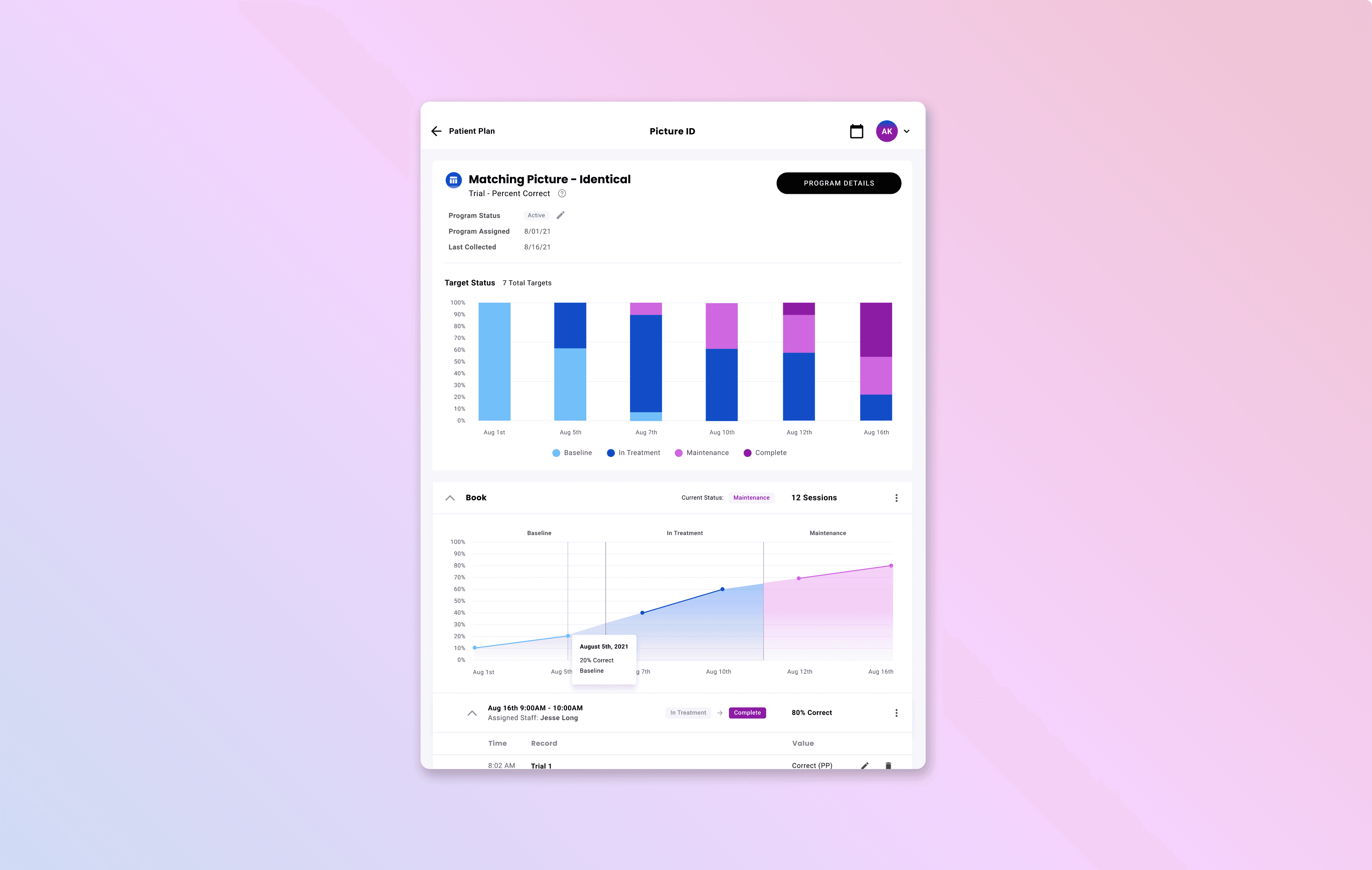
A session view designed for real sessions
Sessions with kids are unpredictable. Therapists need to move quickly between program targets without losing the child's attention. The session view fits a full program plus its target data on one screen, with horizontal swipe between targets, so therapists rarely have to look away to log a tap.


Digitized session view for therapists.
Impact
We delivered a full working product to Raven Health on time. It launched in the App Store and is now used in more than a dozen ABA clinics. The work also supported the startup's next fundraising round. Subsequent releases continued to expand the program library, broaden visualization, and deepen clinician/technician sync.
Video going through a prototype of the full product. View the full prototype
REFLECTION
What I learned.
01
When the domain is unfamiliar, the team's glossary is a design tool.
Designing for ABA without ABA experience could have been a credibility problem. It wasn't, because we built a shared glossary early and kept it living. Treating "shared language" as a deliverable saved hours of meeting confusion and produced better terminology in the UI.
02
Two personas, one product, separate empathy.
Technicians and clinicians are both users, but they care about opposite parts of the product. Holding both empathy maps in view at every decision kept us from optimizing one user's flow at the other's expense.
03
In an industry stuck on paper, the goal isn't more features. It's fewer steps.
The most valuable decisions on this project were subtractive: removing the rebuild-from-scratch step in program creation, the look-away step in session data entry, the export step in progress review. Modern doesn't always mean more. Sometimes it means less, faster.